Create a data portal with a single dataset
Welcome to the PortalJS tutorials series. In this first tutorial, we are going to take a look at a simple data portal example built with PortalJS, understand its structure and learn how we can customize it, specially with data components.
The resulting data portal is our Hello World equivalent: a single dataset, and it looks like this:
This tutorials series is sequential, so the next tutorials starts from where this one left, don't forget to save your progress, and, finally, let's get started!
Create a new PortalJS project
First step is to create a new PortalJS project. To do that, please follow the instructions on the Getting Started section of the docs.
Now, make sure you have the project running on your local environment (npm run dev) and access http://localhost:3000 on your browser. As you can see, the new project is not empty, it already contains some content which we will use as a base in this tutorial. Here's what the page looks like:
Basics
As you can see, the page is very generic, and consists of a header, some text, a table and a line chart (built with Vega). Soon we are going to make it more interesting, but first, how did we end up with this?
The content routing system
Let's start by analyzing the main components of the folder strucutre of the project:
content/
  my-dataset/
    README.md
public/
  data_1.csv
  data_2.csv
You see that README.md file inside the content folder? That's exactly what's being rendered on your browser. PortalJS uses a filesystem approach to content routing, this means that the folder structure inside the content folder determines the routes used to access the pages in the application, a page being a .md (Markdown) file, analogously to a HTML document. When the file is named "README.md", it means that it's an index file. Take a look at the following example:
content/
  README.md  # => Page rendered at /
  folder-1/
    README.md  # => Page rendered at /folder-1
  folder-2/
    README.md  # => Page rendered at /folder-2
    folder-2-1/
      README.md  # => Page rendered at /folder-2/folder-2-1
INTERNAL NOTE: let's change that to index.md instead of README.md. Add examples of non-index pages? The MDX pipeline should be handling other .md files but it's not doing that rn. Maybe remove next paragraph
Note that it's also possible to create non-index pages, but this is not going to be demonstrated on this tutorial for the sake of simplicity.
The pages
Cool, a Markdown file becomes a page, but what is a Markdown file :thinking_face:?
Without getting into much detail, Markdown is a markup language which allows users to write structured and formatted text using a very simple syntax, with the beauty of not leaving the realm of plain text and keeping the document completely human-readable (opposite of, for instance, HTML, in which the document might get messy and very hard to read when it's not being rendered on a browser).
It's not the intent of this tutorial to guide the user throught Markdown, but it's a requirement to understand it, so if you are not familiar with it we encourage you to take a look at this guide written by Datopian (Markdown is going to take over the world, seriously, you won't regret it!).
Now that you are aware of Markdown documents and their application on PortalJS, let's hop to how this page you were seeing on your browser looks like behind the scenes. You probably noticed the cool chart and table on the page. Plain Markdown cannot do that, but the extended Markdown on PortalJS can.
If you open content/README.md on your IDE or any text editor, you are going to come across the following content:
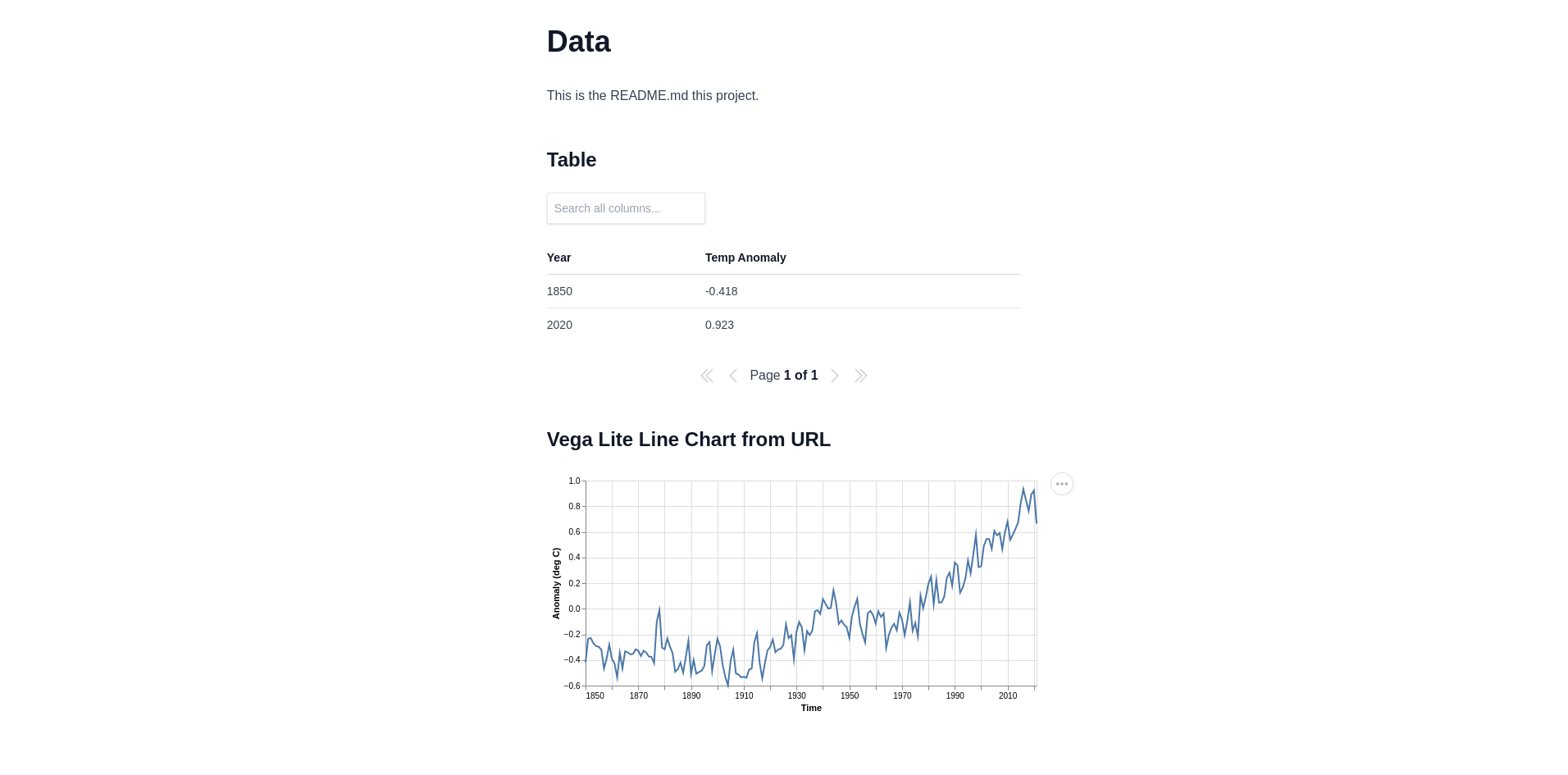
# Data

This is the README.md this project.

## Table

<Table url="data_1.csv" />

## Vega Lite Line Chart from URL

<VegaLite spec={ { "$schema": "https://vega.github.io/schema/vega-lite/v5.json", "data": {"url": "data_2.csv"}, "width": 550, "height": 250, "mark": "line", "encoding": { "x": {"field": "Time", "type": "temporal"}, "y": {"field": "Anomaly (deg C)", "type": "quantitative"}, "tooltip": {"field": "Anomaly (deg C)", "type": "quantitative"} } } } />
Note the <Table /> and the <VegaLite /> components, that's how data components are used on PortalJS, similar to tags on HTML documents. Each data component will have it's own set of attributes. These two are not the only data components that are supported, but it's interesting to note that data components can be used in a way as simple as the table pointing to a CSV file, or as flexible and complex as a chart built using a VegaLite spec.
One other very interesting point to notice here is that both data components are getting its data from the data files inside the public folder. When a relative URL is provided as the data source for a data component, PortalJS will look for the given file in the public folder.
We now have the basics, let's build something.
Making the dataset page more interesting
It's time to start playing around with the project. Let's say we want to create a dataset page to present the data about the TV series Breaking Bad (or feel free choose a different theme and be creative!). Here are some sites with data that we can use:
Open the content/my-dataset/README.md file and delete the content inside it. Now, let's start with a heading and description:
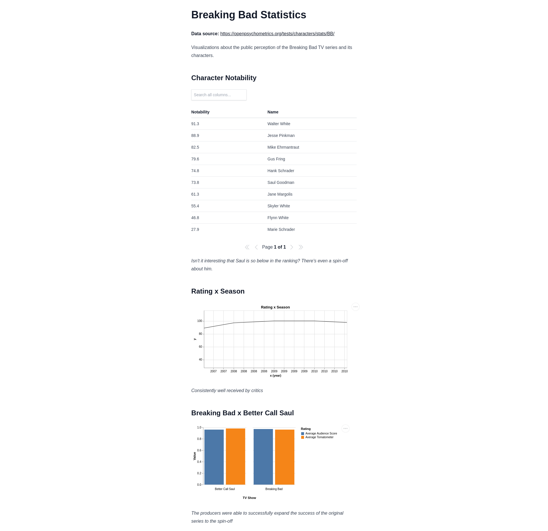
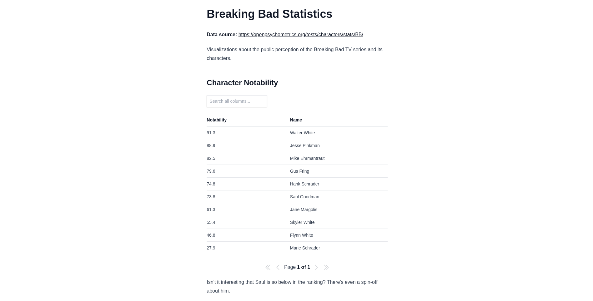
# Breaking Bad Statistics

**Data source:** https://openpsychometrics.org/tests/characters/stats/BB/

Visualizations about the public perception of the Breaking Bad TV series and its characters.
Cool, with that, our intention with this page is now clear. Time to add some visualizations.
Tables
Let's start with a table. There's an interesting table in the dataset about the notability of 10 of the characters on the Openpsychometrics.com Test, let's reproduce that in our page. Here's the data in CSV format:
Notability,Name
91.3,Walter White
88.9,Jesse Pinkman
82.5,Mike Ehrmantraut
79.6,Gus Fring
74.8,Hank Schrader
73.8,Saul Goodman
61.3,Jane Margolis
55.4,Skyler White
46.8,Flynn White
27.9,Marie Schrader
Tables can be created from different data sources on PortalJs, these being:
URL
The URL can be either internal (relative) or external. To create a table from a URL, use the following syntax:
<Table url="data.csv" />  //  Internal, file at /public/data.csv

//  Or

<Table url="https://people.sc.fsu.edu/~jburkardt/data/csv/addresses.csv" />
Inline CSV
To create a table using inline CSV, use the following syntax:
<Table csv={`
Year,Cost
2018,50345.50
2019,65272.20
2020,48413.80
2021,76213.50
2022,71653.60
`} />
Columns and rows
Finally, you can also provide the data in the form of columns and rows using the following syntax:
<Table cols={[
    { key: 'id', name: 'ID' },
    { key: 'firstName', name: 'First name' },
    { key: 'lastName', name: 'Last name' },
    { key: 'age', name: 'Age' }
  ]} data={[
    { id: 1, lastName: 'Snow', firstName: 'Jon', age: 35 },
    { id: 2, lastName: 'Lannister', firstName: 'Cersei', age: 42 },
    { id: 3, lastName: 'Lannister', firstName: 'Jaime', age: 45 },
    { id: 4, lastName: 'Stark', firstName: 'Arya', age: 16 },
    { id: 7, lastName: 'Clifford', firstName: 'Ferrara', age: 44 },
    { id: 8, lastName: 'Frances', firstName: 'Rossini', age: 36 },
    { id: 9, lastName: 'Roxie', firstName: 'Harvey', age: 65 },
  ]}
  />
Now that you are more familiar with the table data component, let's go ahead and add the table to the page. Since there are only a few rows in the data, inline CSV might be a good option for this table, but feel free to create a CSV file or to convert the data to columns and rows if you want. Add that to the end of the file:
## Character Notability
<Table csv={`
Notability,Name
91.3,Walter White
88.9,Jesse Pinkman
82.5,Mike Ehrmantraut
79.6,Gus Fring
74.8,Hank Schrader
73.8,Saul Goodman
61.3,Jane Margolis
55.4,Skyler White
46.8,Flynn White
27.9,Marie Schrader
`} />
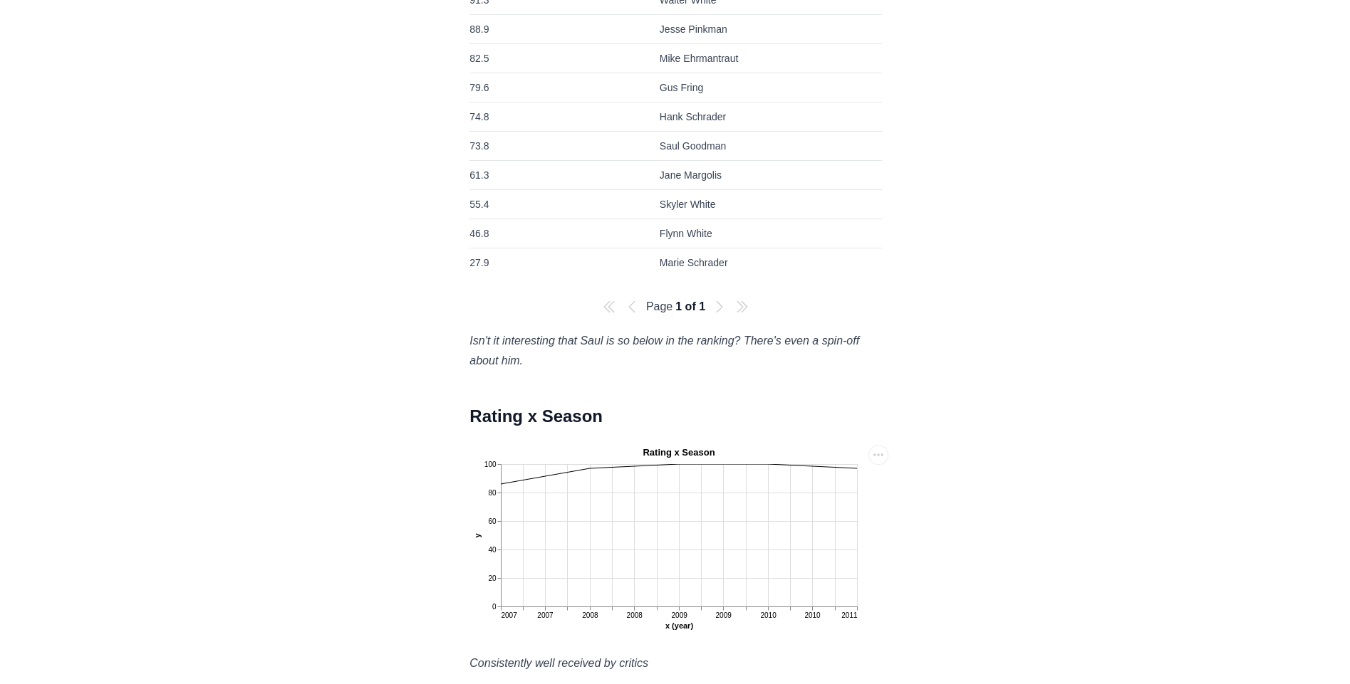
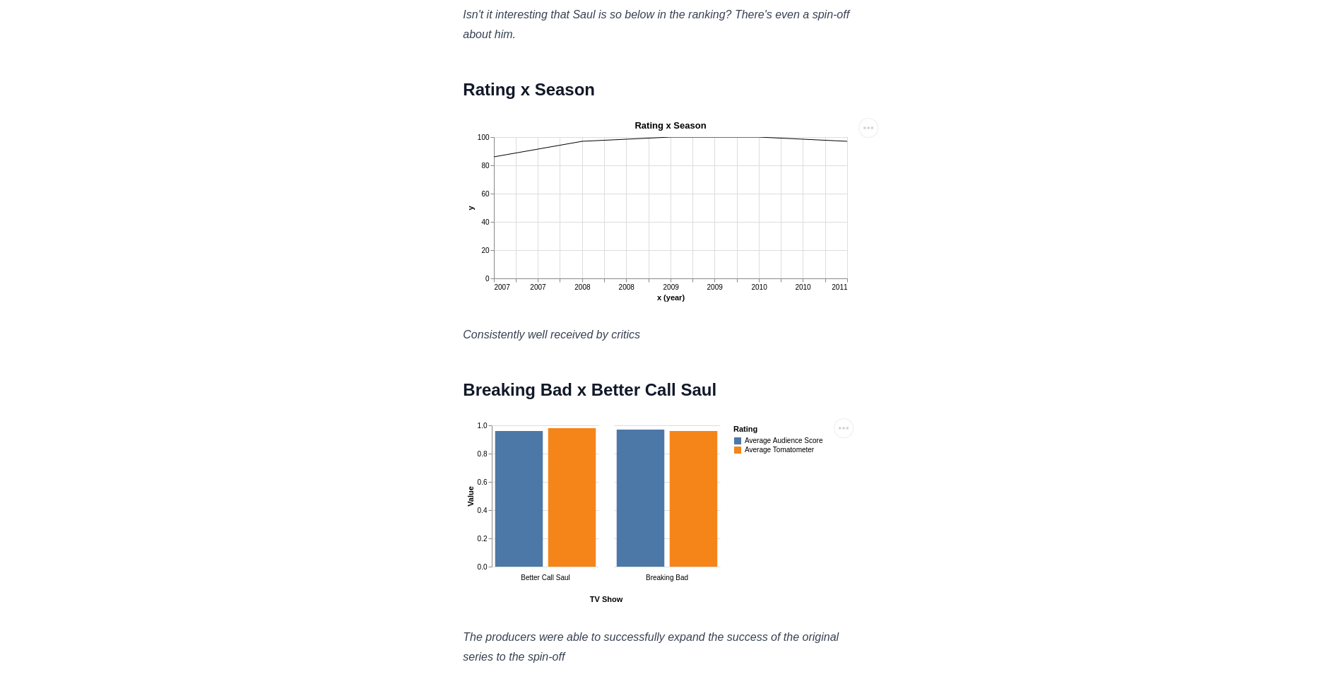
_Isn't it interesting that Saul is so below in the ranking? There's even a spin-off about him._
Here's how it's going to look like on the page:
Simple line charts
Let's use the <LineChart /> data component and the ratings on Rotten Tomatoes to create a rating by year line chart (note that each season was released in a diffent year).
INTERNAL NOTE: LineChart is not working properly on the example, the width is not right. Can't we make numeric X work as well instead of having just years? We still have that bug in which the X is offsetted by -1.
First, here's the data of the rating by season in CSV format:
Year,Rating
2008,86
2009,97
2010,100
2011,100
2012,97
The <LineChart /> data component expects two attributes: title and data, so let's add the following to the end of the file:
## Rating x Season

<LineChart title="Rating x Season" data={
    [
        ["2008",86],
        ["2009",97],
        ["2010",100],
        ["2011",100],
        ["2012",97]
    ]
  }
/>

_Consistently well received by critics_
Here are the results:
Complex charts
Finally, PortalJS also supports the creation of visualizations with Vega and VegaLite. This becomes specially interesting when it's desired to create more complex and custom visualizations. To demonstrate this, let's add a bar chart that compares Breaking Bad to Better Call Saul, a spin-off of the series, based on the data on Rotten Tomatoes. Here's the data in CSV format:
TV Show,Average Tomatometer,Average Audience Score
Breaking Bad,0.96,0.97
Better Call Saul,0.98,0.96
Add that to the file:
## Breaking Bad x Better Call Saul

<VegaLite spec={
  {
    "width": 150,
    "data": {
      "values": [
        {"TV Show": "Breaking Bad", "Rating": "Average Tomatometer", "Value":0.96},
        {"TV Show":"Breaking Bad", "Rating": "Average Audience Score", "Value":0.97},
        {"TV Show":"Better Call Saul", "Rating": "Average Tomatometer", "Value":0.98},
        {"TV Show":"Better Call Saul", "Rating": "Average Audience Score", "Value":0.96}
      ]
    },
    "mark": "bar",
    "encoding": {
      "column": {"field": "TV Show","header": {"orient": "bottom"}},
      "y": {"field": "Value", "type": "quantitative"},
      "x": {"field": "Rating", "axis": null},
      "color": {"field": "Rating"}
    },
    "config": {
      "view": {"stroke": "transparent"}
    }
  }
} />

_The producers were able to successfully expand the success of the original series to the spin-off_
It's going to look like this when you navigate to the page again:
Final results
Here's the whole source code of the dataset page we built:
# Breaking Bad Statistics

**Data source:** https://openpsychometrics.org/tests/characters/stats/BB/

Visualizations about the public perception of the Breaking Bad TV series and its characters.

## Character Notability

<Table csv={`
Notability,Name
91.3,Walter White
88.9,Jesse Pinkman
82.5,Mike Ehrmantraut
79.6,Gus Fring
74.8,Hank Schrader
73.8,Saul Goodman
61.3,Jane Margolis
55.4,Skyler White
46.8,Flynn White
27.9,Marie Schrader
`} />

_Isn't it interesting that Saul is so below in the ranking? There's even a spin-off about him._

## Rating x Season

<LineChart title="Rating x Season" data={
    [
        ["2008",86],
        ["2009",97],
        ["2010",100],
        ["2011",100],
        ["2012",97]
    ]
  }
/>

_Consistently well received by critics_

## Breaking Bad x Better Call Saul

<VegaLite spec={
  {
    "width": 150,
    "data": {
      "values": [
        {"TV Show": "Breaking Bad", "Rating": "Average Tomatometer", "Value":0.96},
        {"TV Show":"Breaking Bad", "Rating": "Average Audience Score", "Value":0.97},
        {"TV Show":"Better Call Saul", "Rating": "Average Tomatometer", "Value":0.98},
        {"TV Show":"Better Call Saul", "Rating": "Average Audience Score", "Value":0.96}
      ]
    },
    "mark": "bar",
    "encoding": {
      "column": {"field": "TV Show","header": {"orient": "bottom"}},
      "y": {"field": "Value", "type": "quantitative"},
      "x": {"field": "Rating", "axis": null},
      "color": {"field": "Rating"}
    },
    "config": {
      "view": {"stroke": "transparent"}
    }
  }
} />

_The producers were able to successfully expand the success of the original series to the spin-off_
And here's a screenshot of what it looks like:

Next steps
Now that you already know how to create pages and render data components, we encourage you to play around with this project. You can try adding new visualizations, changing values, or creating a new page about something you find interesting.
Finally, proceed to the next tutorial in the series.